Some like it, some hate it, others are not so sure.
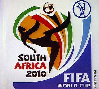
The logo, designed for the 2010 event in South Africa, represents the shape of Africa in the colours of our flag. Superimposed over it is a somewhat abstract figure of a footballer, possibly inspired by San art, executing an overhead "bicycle" kick.
Graphic designers in Cape Town said they were generally disappointed feeling that it had had potential to be much better.
What's your say?
Search
Me

About
A sparking curious mind, who dares to struggle in order to win. Views my own, unless stated otherwise.
Get in touch!
Contributor to
Tweet Level
Daily Dose
Romanian Blogs
Planning Globe
- APG
- Account Planning Romania
- APG Australia
- This Blog Sits at the
- John Griffiths
- Adliterate
- Blurb
- John Grant
- The Hidden Persuader
- Russell Davies
- Pink Air
- Conformists Unite
- David Nottoli
- No Man's Blog
- Talent Imitates
- Brand New
- Holy Cow
- Piece
- Organic Frog
- Big Picture
- Planningblog
- Chroma
- Influx
- Ad Pit
- Fallon Planning Blog
- Planning On Subversion
- Northern Planner
- Rock'n'roll & Advertising
- Kevin Rothermel
- Skeeballers
- Plannerliness
- Espinha
- Planning from the outside
Random Inspiration
Blogroll
- Advertising/Design Goodness
- Ad Hunt
- Ad ++
- Ad Freak
- Adhurl
- Adjab
- Ad Pulp
- Adrants
- AdScam/The Horror!
- Adtrocius
- Adverblog
- Armchair Media
- Authentic Boredom
- blog Fabrica
- Bannerblog
- Be A Design Group
- Being Reasonable
- Bigshinything
- Billboardom
- Blogfonk
- Brainstorm 9
- Brand Noise
- Brand Flakes for Breakfast
- Everything's Better with Brentter
- CoolzOr
- Copyranter
- Core 77
- Design+Innovation
- Creative Generalist
- Direct Daily
- Ernie Schenck
- Fast Company
- Fontleech
- Fontlover
- Groupies
- Hyper Inked
- Ideamill
- Industrial
- Killer Viral
- Le Blog Personnel
- Marketing Babylon
- M!ndless
- Make The Logo Bigger
- Marketing Alternatif
- Media Culpa
- Media Savvy
- MIT Advertising Lab
- MIT Convergence Culture
- Modern Marketing
- Much Ado About MKTG
- Jupiter Research
- Netzkobold
- Partnes+simons
- PR Studies
- Publicidade off-the-record
- Micro Persuasion
- the fruits of imagination
Archives
- feb. 2014 (2)
- dec. 2013 (1)
- nov. 2013 (2)
- oct. 2013 (1)
- iun. 2013 (1)
- mai 2013 (2)
- apr. 2013 (2)
- mar. 2013 (4)
- feb. 2013 (12)
- oct. 2012 (3)
- sept. 2012 (1)
- iul. 2012 (1)
- iun. 2012 (2)
- mai 2012 (4)
- apr. 2012 (7)
- mar. 2012 (10)
- feb. 2012 (3)
- ian. 2012 (5)
- dec. 2011 (3)
- nov. 2011 (8)
- oct. 2011 (4)
- sept. 2011 (6)
- aug. 2011 (4)
- iul. 2011 (4)
- iun. 2011 (2)
- apr. 2011 (3)
- mar. 2011 (3)
- feb. 2011 (6)
- ian. 2011 (6)
- dec. 2010 (5)
- nov. 2010 (1)
- oct. 2010 (1)
- sept. 2010 (2)
- aug. 2010 (2)
- iul. 2010 (3)
- mai 2010 (1)
- apr. 2010 (5)
- mar. 2010 (6)
- feb. 2010 (4)
- ian. 2010 (2)
- dec. 2009 (13)
- nov. 2009 (3)
- oct. 2009 (4)
- sept. 2009 (5)
- aug. 2009 (3)
- iul. 2009 (2)
- iun. 2009 (4)
- aug. 2008 (2)
- iul. 2008 (3)
- mai 2008 (2)
- apr. 2008 (3)
- mar. 2008 (7)
- feb. 2008 (10)
- ian. 2008 (1)
- oct. 2007 (3)
- sept. 2007 (13)
- aug. 2007 (19)
- iul. 2007 (12)
- iun. 2007 (20)
- mai 2007 (17)
- apr. 2007 (16)
- mar. 2007 (17)
- aug. 2006 (20)
- iul. 2006 (34)
- iun. 2006 (29)
- mai 2006 (40)
- apr. 2006 (24)
- mar. 2006 (2)


Trimiteți un comentariu